
As a long time Starcraft 1 & 2 player I could not resist sharing some exciting UI news related to Starcraft 2. Now, let me first say I do share the same grievances people have about overall the way Blizzard deals with UI in their games. More often than not their UI is overly skeuomorphic, saturated and demanding way too much attention from the player.
Now with that said, I think this recent announcement of a UI revamp in Starcraft 2 is at least showing signs that Blizzard is starting to fix the 3rd problem. The focus seems to be moving away from the interface and more into the characters and environments.
And this is great!!
ARVE error: need id and provider
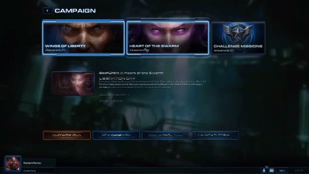
Below you can see just how much cleaner the UI has become. The campaign selection has done away with the large boxes and replaced by the major races that you get to play in each campaign.

All of the navigation has been been moved to the top of the screen in a simple tabbed navigation that drops more tabs to select below. This creates a unified and focused experience in the most important part of the screen real estate.
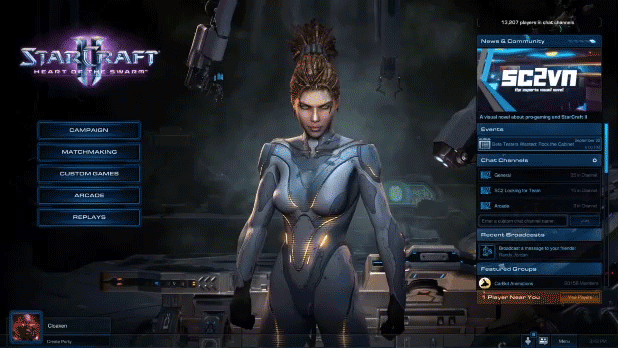


For the most part, the right side of the screen has been freed up from clutter allowing for a more pleasant experience when you expand your chat window, nicely presenting both the social and game UI.


When you’re tasked to do designs for such a big franchise it is wishful thinking to presume you’ll be able to fix all of the major historical design problems that Blizzard has had with it’s well established franchises so I don’t blame them for not taking the revamp even further. Well done to the UI team on SC2! You guys did a great job!


